The #1 Mistake Authors Make That Kills Book Sales

"What else can I do to market my book?"
I asked her to pull it up on Amazon.
Lo and behold, the answer was staring us in the face.
The cover sucked.
But not in a "Wow, that's a terrible cover" way.
More in a "This is clearly an amateur design" way.
She suspected it might be the case, but she'd gone with it anyway.
The real problem wasn't quite as obvious, which is why this is such a common scenario in the first place:
What happens when a potential reader sees that amateur cover?
They instantly assume the content is bad.
They decide not to read it, not to buy it. The book is crippled by its own packaging.
I asked who designed the cover for her.
"Our in-house designer. They're great at designing our PowerPoints."
They might be great at design, but they have no clue how to design a book cover.
And that is the biggest landmine in publishing, the #1 mistake that so often kills good books: Mediocre covers.
Do you know what makes-or-breaks a YouTube video?
It's not the content – it's the thumbnail.
And do you know what separates amateur YouTubers from professionals?
Amateurs: Design the thumbnail themselves, or pay an overseas designer on Fiverr / Upwork to slap one together in Canva. Either way, it's a complete afterthought. Then they wonder why their video isn't getting views. ("bUt ThE vIdEo iS sO gOoD!!!!1")
Professionals: Understand the thumbnail is the viewer's first touchpoint, and therefore the most critical. Pro YouTubers might not even start making the video until they have the thumbnail concept nailed. Then, they invest in the BEST possible design (Mr. Beast spends $10,000 per thumbnail), and split-test multiple versions until they land on a winner.
Having a great YouTube thumbnail can literally be the difference between 100 views and 1,000,000 views.
The same can be said of your book cover.
And while a great book cover doesn't always guarantee more sales, it does make a massive difference between readers taking you seriously... or not.
In this article, I'm going to share:
- Why So Many Good Authors Have Mediocre Covers
- How a Mediocre Cover Damages Your Brand and Business
- My Process for Ensuring You Get a World-Class Cover
Why So Many Good Authors Have Mediocre Covers
Here are the two most common dynamics I see:
- Amateur publishing houses with low standards and bad processes.
- Self-published authors hire the wrong designers, then fail to communicate their style preferences.
The first is unfortunately very common. You'd think a company built on making books would know better, but they often don't. Amateur publishing houses are basically run by C-students with no taste. Which was a fine way to operate in high school, but when it comes to entrusting them with your livelihood and reputation, you shouldn't be settling for mediocrity.
How do you know if you're working with a C-student publishing house? It's shockingly easy. Just look at the books they've published. Based on the covers alone, would you be excited to read most of them? Would you be proud to have your book right alongside their "success stories"? Or have they published a sea of unremarkable, unimportant books?
That usually clears things up real fast.
The second dynamic of the author hiring the wrong designer, then failing to effectively communicate with them, is also very common. I'll teach you how to fix those issues in the last section of this article.
You might be wondering, What does a mediocre cover look like?
It's hard for me to show you without punching down on other authors and publishing houses, so I'll refrain from making them into examples.
Instead, let's use two of my book covers. One is amateur, the other is professional. See if you can tell which is which:


Now, you might think the one on the left isn't that bad.
But it IS that bad.
Literally anyone could have made that cover, in a matter of minutes.
But if you asked 1,000 people to re-create the one on the right, they could not do it.
Only a professional designer can make that (thanks, Erin).
Now, I did the one on the left as an experiment. I took the book off of Amazon long ago, as I had zero expectations for Stress Hacks to contribute to my business or brand. It quickly felt like more of a liability than an asset.
But what about a book that you're depending on to bring in new clients? Or speaking gigs? Or business opportunities?
You better make sure that cover is stunning. Here's why...
How a Mediocre Cover Damages Your Brand and Business
"Don't judge a book by its cover!" – Author who designed their own cover
Imagine you're about to go on a date with your future spouse.
You've been told that they are the PERFECT match for you. The best you'll ever do. They will bring you a lifetime of happiness.
You picture them in your mind, and you can barely contain your excitement.
Then, you show up to the date. Your "perfect match" is wearing a tie-dye shirt that says "MARRY ME." Their hair is messy. Their shoes are old New Balances.
Do you accept that they are your perfect match...
Or do you instantly dismiss them based off of their appearance?
Almost certainly the latter (although I do love New Balances).
That's because what they are signaling is misaligned with your expectations.
And that's what a mediocre book cover does to your brand and business. Even if you're the best person in the world, and your business is truly world-class, your mediocre cover is signaling You ain't it.
And it could be costing you millions of dollars.
Don't believe me? Here's another example:
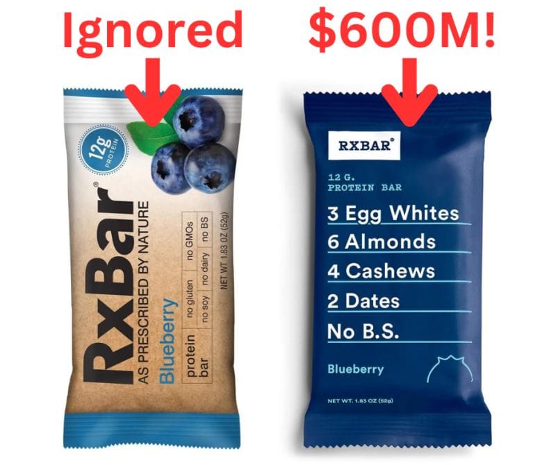
Same product, different packaging.
Now think about this when it comes to you and your book...
If you're a top-tier expert with a book cover that screams "amateur" or "ugly" or "weird" or "slightly off" or even "just like everyone else"...
Then why would you expect a total stranger to view you in a positive light?
Like it or not, people WILL and DO judge you based on your book cover. And they do it instantaneously.
They assume a bunch of things about you and your book – within a couple of seconds – based on how your cover looks and makes them feel. With that one piece of paper, you have signaled your position and value in the marketplace.
Your cover influences whether they will hire you, or not...
Your cover influences whether they believe you're an interesting expert, or just another wannabe...
And your cover influences whether they'll read your book, or donate it to a Little Free Library.
The question is this: Will you hold your cover design to the highest standard, or settle for average?
My suggestion: The standard you should hold your cover to is one that matches your own excellence, and elevates you in the marketplace (rather than diminishes you).
Here's how to achieve that.
My Process for Ensuring You Get a World-Class Cover
It's very simple, really. Just follow these steps and you'll be thrilled with the outcome.
- Decide that you'll only work with the world's best cover designers. No more Fiverr. No more Upwork. No more 99Designs. No more farming it out to a publishing house that only puts out mediocre work. You must insist on staying away from average designers, and only going with the best. You can find the best at INeedABookCover.com. My two favorites are Pete Garceau and Erin Tyler.
- Create a cover brief. I once heard the CEO of a publishing house say "Sometimes it takes 20 rounds to get the cover right." Twenty rounds? Yikes. Not how I like to play. You can usually get the cover nailed within two rounds if you take the time to clearly communicate your style preferences upfront. The way you do that is by creating a creative brief, which you can do HERE.
- Invest in a world-class design. I recommend spending at least $2,000 on your cover. "$2,000?!" Yes. If budget allows, please go upwards of $3,000+. And if you think working with pros is expensive, try working with amateurs. What you save upfront with an amateur is lost 100X in opportunity costs – from all the clients who instantly decided to not give you and your book a shot.
- Trust your designer. Most authors are used to being in control and directing people. You need to fight that impulse during this process. You hired an ARTIST, not a minion. You wouldn't tell Picasso to make the font bigger. Be warned that you might have a negative emotional reaction when you get your first round of designs back. "This is it? It's not at all what I pictured in my head!" Breathe. This is a normal response. Thank your designer, let them know you want to sit with their beautiful designs for the next 48 hours before you give any feedback. Now, how do you give them feedback?
- Ask questions. Instead of telling them "I hate the colors" or "I want to do blue," ask them "Can you talk me through these color choices?" and "Are there any other colors you considered?" and "Do you believe blue would work well here, or no?" They have more than a decade of experience, and oftentimes hundreds of covers under their belt. I can assure you that they know A LOT more than you about color choice, font selection, type spacing, etc. I'm not saying their designs will be perfect, but the likelihood that their stylistic choices are more right than yours is near 100%.
- Go with the bold cover that you'll love living with. You can test the cover all you want - on PickFu, with Facebook ads, or putting it in front of your target readers. And that data is helpful. But at the end of the day, this is your book. You get to live with this cover design, so make sure it's one you'll love. Just remember that the battle your book is fighting is whether its overlooked and forgotten. So whenever possible, go BOLD.
Was this post helpful? Do you want to see more like this?
Reply and let me know!
Member discussion